Box Model
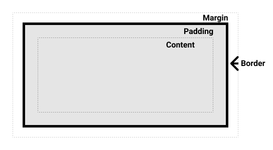
Fonte: MDN
Display
| Display | Flow | Margin, Border, Padding | Height | Width |
|---|---|---|---|---|
| Inline | surrounding text without creating line breaks before | Ok | ||
| Block | stacked upon other boxes | Ok | Ok | Ok |
| Inline-block | surrounding text without creating line breaks before | Ok | Ok | Ok |
| none | turns off the display of an element |
Fonte: MDN
Inline box
<p><span>Lorem ipsum</span> <span>dolor</span></p><p><span>Lorem ipsum</span> <span>dolor</span></p>Referências: Inline elements | MDN
Block box
<p>Lorem ipsum</p>
<p>Dolor</p><p>Lorem ipsum</p>
<p>Dolor</p>Referências: Block-level elements | MDN
Inline-block box
<ul>
  <li>Lorem ipsum</li>
  <li>dolor</li>
</ul><ul>
<li>Lorem ipsum</li>
<li>dolor</li>
</ul>ul li {
display: inline-block;
}
ul li {
  display: inline-block;
}
Border
MDN:
Value:
<br-width>||<br-style>||<color><br-width>=<length>| thin | medium | thick<br-style>= none | hidden | dotted | dashed | solid | double | groove | ridge | inset | outset
/* style */
border: solid;

/* width | style */
border: 2px dotted;

/* style | color */
border: outset #f33;

/* width | style | color */
border: medium dashed green;/* style */
border: solid;
/* width | style */
border: 2px dotted;
/* style | color */
border: outset #f33;
/* width | style | color */
border: medium dashed green;Shorthand:
Border:
<p id="first">Lorem ipsum</p>
<p id="last">Lorem ipsum</p><p id="first">Lorem ipsum</p>
<p id="last">Lorem ipsum</p>html.dark * {
border-color: #fff !important;
}
#first {
border: 2px dotted #000;
}
#last {
border: 5px solid #000;
}
html.dark * {
  border-color: #fff !important;
}

#first {
  border: 2px dotted #000;
}

#last {
  border: 5px solid #000;
}
Estilo:
<p>Lorem ipsum</p><p>Lorem ipsum</p>html.dark * {
border-color: #fff !important;
}
p {
border: 2px solid #000;
border-top: dotted;
border-right: outset;
border-bottom: dashed;
}
html.dark * {
  border-color: #fff !important;
}

p {
  border: 2px solid #000;
  border-top: dotted;
  border-right: outset;
  border-bottom: dashed;
}
Margin
Value: [
<length>|<percentage>| auto ]4
/* Apply to all four sides */
margin: 1em;
margin: -3px;

/* vertical | horizontal */
margin: 5% auto;

/* top | horizontal | bottom */
margin: 1em auto 2em;

/* top | right | bottom | left */
margin: 2px 1em 0 auto;/* Apply to all four sides */
margin: 1em;
margin: -3px;
/* vertical | horizontal */
margin: 5% auto;
/* top | horizontal | bottom */
margin: 1em auto 2em;
/* top | right | bottom | left */
margin: 2px 1em 0 auto;Shorthand:
| Shorthand | Longhand |
|---|---|
margin | margin-bottommargin-leftmargin-rightmargin-top |
margin-block:
<p>Lorem ipsum</p>
<p class="margin">Lorem ipsum</p><p>Lorem ipsum</p>
<p class="margin">Lorem ipsum</p>html.dark * {
border-color: #fff !important;
}
.margin {
border: 5px solid #000;
margin: 3rem;
}
html.dark * {
  border-color: #fff !important;
}

.margin {
  border: 5px solid #000;
  margin: 3rem;
}
margin-inline:
<p>Lorem <span>ipsum</span> dolor.</p><p>Lorem <span>ipsum</span> dolor.</p>span {
border: 2px solid #000;
margin-left: 20px;
margin-right: 1em;
}
span {
  border: 2px solid #000;
  margin-left: 20px;
  margin-right: 1em;
}
Padding
Value: [
<length>|<percentage>]4
/* Apply to all four sides */
padding: 1em;

/* vertical | horizontal */
padding: 5% 10%;

/* top | horizontal | bottom */
padding: 1em 2em 2em;

/* top | right | bottom | left */
padding: 5px 1em 0 2em;/* Apply to all four sides */
padding: 1em;
/* vertical | horizontal */
padding: 5% 10%;
/* top | horizontal | bottom */
padding: 1em 2em 2em;
/* top | right | bottom | left */
padding: 5px 1em 0 2em;Shorthand:
| Shorthand | Longhand |
|---|---|
padding | padding-bottompadding-leftpadding-rightpadding-top |
padding-block:
<p>Lorem ipsum</p><p>Lorem ipsum</p>* {
border-color: var(--color-primary) !important;
}
p {
border: 5px solid #000;
padding: 3rem;
}
* {
  border-color: var(--color-primary) !important;
}

p {
  border: 5px solid #000;
  padding: 3rem;
}
padding-inline:
<p>Lorem <span>ipsum</span> dolor.</p><p>Lorem <span>ipsum</span> dolor.</p>* {
border-color: var(--color-primary) !important;
}
p {
margin-top: 2rem;
}
span {
border: 2px solid #000;
padding-left: 20px;
padding-right: 1em;
padding-top: 1em;
}
* {
  border-color: var(--color-primary) !important;
}

p {
  margin-top: 2rem;
}

span {
  border: 2px solid #000;
  padding-left: 20px;
  padding-right: 1em;
  padding-top: 1em;
}
Width
Value: [
<length>|<percentage>| auto ]
/* <length> values */
width: 300px;
width: 25em;

/* <percentage> value */
width: 75%;/* <length> values */
width: 300px;
width: 25em;
/* <percentage> value */
width: 75%;Exemplo:
<p>Lorem ipsum</p>
<p class="w_400">Lorem ipsum</p>
<p class="w_400 m_auto">Lorem ipsum</p>
<p class="w_400 ml_auto">Lorem ipsum</p><p>Lorem ipsum</p>
<p class="w_400">Lorem ipsum</p>
<p class="w_400 m_auto">Lorem ipsum</p>
<p class="w_400 ml_auto">Lorem ipsum</p>* {
border-color: var(--color-primary) !important;
}
p {
border: 5px solid #000;
}
.w_400 {
width: 400px;
}
@media (max-width: 640px) {
.w_400 {
width: 40%;
}
}
.m_auto {
margin: auto;
}
.ml_auto {
margin-left: auto;
}
* {
  border-color: var(--color-primary) !important;
}

p {
  border: 5px solid #000;
}

.w_400 {
  width: 400px;
}

@media (max-width: 640px) {
  .w_400 {
    width: 40%;
  }
}

.m_auto {
  margin: auto;
}

.ml_auto {
  margin-left: auto;
}
min-width e max-width
<p>Lorem ipsum</p><p>Lorem ipsum</p>* {
border-color: var(--color-primary) !important;
}
p {
border: 5px solid #000;
width: 40%;
min-width: 200px;
}
* {
  border-color: var(--color-primary) !important;
}

p {
  border: 5px solid #000;
  width: 40%;
  min-width: 200px;
}
Height
Value: [
<length>|<percentage>| auto ]
/* <length> values */
height: 300px;
height: 25em;

/* <percentage> value */
height: 75%;/* <length> values */
height: 300px;
height: 25em;
/* <percentage> value */
height: 75%;Exemplo:
<p>Lorem ipsum</p>
<p></p>
<p class="h_100">Lorem ipsum</p><p>Lorem ipsum</p>
<p></p>
<p class="h_100">Lorem ipsum</p>* {
border-color: var(--color-primary) !important;
}
p {
border: 5px solid #000;
}
.h_100 {
height: 100px;
}
* {
  border-color: var(--color-primary) !important;
}

p {
  border: 5px solid #000;
}

.h_100 {
  height: 100px;
}
Border Radius
Value:
<length-percentage>4 [ /<length-percentage>4 ]?
<length-percentage>=<length>|<percentage>
/* Radius is set for all 4 sides */
border-radius: 10px;

/* top-left-and-bottom-right | top-right-and-bottom-left */
border-radius: 10px 5%;

/* top-left | top-right-and-bottom-left | bottom-right */
border-radius: 2px 4px 2px;

/* top-left | top-right | bottom-right | bottom-left */
border-radius: 1px 0 3px 4px;

/* (first radius values) / radius */
border-radius: 10px 5% / 20px;

/* (first radius values) / top-left-and-bottom-right | top-right-and-bottom-left */
border-radius: 10px 5% / 20px 30px;

/* (first radius values) / top-left | top-right-and-bottom-left | bottom-right */
border-radius: 10px 5px 2em / 20px 25px 30%;

/* (first radius values) / top-left | top-right | bottom-right | bottom-left */
border-radius: 10px 5% / 20px 25em 30px 35em;/* Radius is set for all 4 sides */
border-radius: 10px;
/* top-left-and-bottom-right | top-right-and-bottom-left */
border-radius: 10px 5%;
/* top-left | top-right-and-bottom-left | bottom-right */
border-radius: 2px 4px 2px;
/* top-left | top-right | bottom-right | bottom-left */
border-radius: 1px 0 3px 4px;
/* (first radius values) / radius */
border-radius: 10px 5% / 20px;
/* (first radius values) / top-left-and-bottom-right | top-right-and-bottom-left */
border-radius: 10px 5% / 20px 30px;
/* (first radius values) / top-left | top-right-and-bottom-left | bottom-right */
border-radius: 10px 5px 2em / 20px 25px 30%;
/* (first radius values) / top-left | top-right | bottom-right | bottom-left */
border-radius: 10px 5% / 20px 25em 30px 35em;Shorthand:
| Shorthand | Longhand |
|---|---|
border-radius | border-top-left-radiusborder-top-right-radiusborder-bottom-right-radiusborder-bottom-left-radius |
border-radius: 1em/5em;

/* ... is equivalent to: */
border-top-left-radius: 1em 5em;
border-top-right-radius: 1em 5em;
border-bottom-right-radius: 1em 5em;
border-bottom-left-radius: 1em 5em;

border-radius: 4px 3px 6px / 2px 4px;

/* ... is equivalent to: */
border-top-left-radius: 4px 2px;
border-top-right-radius: 3px 4px;
border-bottom-right-radius: 6px 2px;
border-bottom-left-radius: 3px 4px;border-radius: 1em/5em;
/* ... is equivalent to: */
border-top-left-radius: 1em 5em;
border-top-right-radius: 1em 5em;
border-bottom-right-radius: 1em 5em;
border-bottom-left-radius: 1em 5em;
border-radius: 4px 3px 6px / 2px 4px;
/* ... is equivalent to: */
border-top-left-radius: 4px 2px;
border-top-right-radius: 3px 4px;
border-bottom-right-radius: 6px 2px;
border-bottom-left-radius: 3px 4px;Exemplo:
<div>
  <div class="card p-1 m-05 border rounded">Rounded</div>
  <div class="card p-1 m-05 border rounded-md">Rounded MD</div>
  <div class="card p-1 m-05 border rounded-full">Rounded Full</div>
</div><div>
<div class="card p-1 m-05 border rounded">Rounded</div>
<div class="card p-1 m-05 border rounded-md">Rounded MD</div>
<div class="card p-1 m-05 border rounded-full">Rounded Full</div>
</div>* {
border-color: var(--color-primary) !important;
}
.card {
display: inline-block;
text-align: center;
}
@media (max-width: 640px) {
.card {
display: block;
}
}
.m-05 {
margin: 0.5rem;
}
.p-1 {
padding: 1rem;
}
.p-2 {
padding: 2rem;
}
.border {
border: 1px solid #000;
}
.rounded {
border-radius: 0.25rem; /* 4px */
}
.rounded-md {
border-radius: 0.375rem; /* 6px */
}
.rounded-full {
border-radius: 99999px;
}
* {
  border-color: var(--color-primary) !important;
}

.card {
  display: inline-block;
  text-align: center;
}

@media (max-width: 640px) {
  .card {
    display: block;
  }
}

.m-05 {
  margin: 0.5rem;
}

.p-1 {
  padding: 1rem;
}

.p-2 {
  padding: 2rem;
}

.border {
  border: 1px solid #000;
}

.rounded {
  border-radius: 0.25rem; /* 4px */
}

.rounded-md {
  border-radius: 0.375rem; /* 6px */
}

.rounded-full {
  border-radius: 99999px;
}
Box Shadow
Value: none |
<shadow>
<shadow>= inset? &&<length>4 &&<color>?
/* offset-x | offset-y | color */
box-shadow: 60px -16px teal;

/* offset-x | offset-y | blur-radius | color */
box-shadow: 10px 5px 5px black;

/* offset-x | offset-y | blur-radius | spread-radius | color */
box-shadow: 2px 2px 2px 1px rgba(0, 0, 0, 0.2);

/* inset | offset-x | offset-y | color */
box-shadow: inset 5em 1em gold;

/* Any number of shadows, separated by commas */
box-shadow: 3px 3px red, -1em 0 0.4em olive;/* offset-x | offset-y | color */
box-shadow: 60px -16px teal;
/* offset-x | offset-y | blur-radius | color */
box-shadow: 10px 5px 5px black;
/* offset-x | offset-y | blur-radius | spread-radius | color */
box-shadow: 2px 2px 2px 1px rgba(0, 0, 0, 0.2);
/* inset | offset-x | offset-y | color */
box-shadow: inset 5em 1em gold;
/* Any number of shadows, separated by commas */
box-shadow: 3px 3px red, -1em 0 0.4em olive;Exemplo:
<div>
  <div class="card p-1 m-05 bg-gray-100 shadow-sm">Shadow SM</div>
  <div class="card p-1 m-05 bg-gray-100 shadow">Shadow</div>
  <div class="card p-1 m-05 bg-gray-100 shadow-md">Shadow MD</div>
  <div class="card p-1 m-05 bg-gray-100 shadow-lg">Shadow LG</div>
</div><div>
<div class="card p-1 m-05 bg-gray-100 shadow-sm">Shadow SM</div>
<div class="card p-1 m-05 bg-gray-100 shadow">Shadow</div>
<div class="card p-1 m-05 bg-gray-100 shadow-md">Shadow MD</div>
<div class="card p-1 m-05 bg-gray-100 shadow-lg">Shadow LG</div>
</div>body {
background-color: white;
}
.bg-gray-100 {
background-color: #f3f4f6;
}
.color-black {
color: black;
}
.card {
display: inline-block;
text-align: center;
}
@media (max-width: 640px) {
.card {
display: block;
}
}
.m-05 {
margin: 0.5rem;
}
.p-1 {
padding: 1rem;
}
.p-2 {
padding: 2rem;
}
.shadow {
box-shadow: 0 1px 3px 0 rgb(0 0 0 / 0.1), 0 1px 2px -1px rgb(0 0 0 / 0.1);
}
.shadow-sm {
box-shadow: 0 1px 2px 0 rgb(0 0 0 / 0.05);
}
.shadow-md {
box-shadow: 0 4px 6px -1px rgb(0 0 0 / 0.1), 0 2px 4px -2px rgb(0 0 0 / 0.1);
}
.shadow-lg {
box-shadow: 0 10px 15px -3px rgb(0 0 0 / 0.1), 0 4px 6px -4px rgb(0 0 0 / 0.1);
}
body {
  background-color: white;
}

.bg-gray-100 {
  background-color: #f3f4f6;
}

.color-black {
  color: black;
}

.card {
  display: inline-block;
  text-align: center;
}

@media (max-width: 640px) {
  .card {
    display: block;
  }
}

.m-05 {
  margin: 0.5rem;
}

.p-1 {
  padding: 1rem;
}

.p-2 {
  padding: 2rem;
}

.shadow {
  box-shadow: 0 1px 3px 0 rgb(0 0 0 / 0.1), 0 1px 2px -1px rgb(0 0 0 / 0.1);
}

.shadow-sm {
  box-shadow: 0 1px 2px 0 rgb(0 0 0 / 0.05);
}

.shadow-md {
  box-shadow: 0 4px 6px -1px rgb(0 0 0 / 0.1), 0 2px 4px -2px rgb(0 0 0 / 0.1);
}

.shadow-lg {
  box-shadow: 0 10px 15px -3px rgb(0 0 0 / 0.1), 0 4px 6px -4px rgb(0 0 0 / 0.1);
}
Referências:
Border Collapse
Value: collapse | separate
/* Keyword values */
border-collapse: collapse;
border-collapse: separate;/* Keyword values */
border-collapse: collapse;
border-collapse: separate;Exemplo:
<table class="separate">
  <tbody>
    <tr>
      <td>Item 1.1</td>
      <td>Item 1.2</td>
      <td>Item 1.3</td>
    </tr>
    <tr>
      <td>Item 2.1</td>
      <td>Item 2.2</td>
      <td>Item 2.3</td>
    </tr>
  </tbody>
</table>

<table class="collapse">
  <tbody>
    <tr>
      <td>Item 1.1</td>
      <td>Item 1.2</td>
      <td>Item 1.3</td>
    </tr>
    <tr>
      <td>Item 2.1</td>
      <td>Item 2.2</td>
      <td>Item 2.3</td>
    </tr>
  </tbody>
</table><table class="separate">
<tbody>
<tr>
<td>Item 1.1</td>
<td>Item 1.2</td>
<td>Item 1.3</td>
</tr>
<tr>
<td>Item 2.1</td>
<td>Item 2.2</td>
<td>Item 2.3</td>
</tr>
</tbody>
</table>
<table class="collapse">
<tbody>
<tr>
<td>Item 1.1</td>
<td>Item 1.2</td>
<td>Item 1.3</td>
</tr>
<tr>
<td>Item 2.1</td>
<td>Item 2.2</td>
<td>Item 2.3</td>
</tr>
</tbody>
</table>* {
border-color: var(--color-primary) !important;
}
.separate {
border-collapse: separate;
border-spacing: 0.5rem;
}
.collapse {
border-collapse: collapse;
}
td {
border: 1px solid #000;
}
* {
  border-color: var(--color-primary) !important;
}

.separate {
  border-collapse: separate;
  border-spacing: 0.5rem;
}

.collapse {
  border-collapse: collapse;
}

td {
  border: 1px solid #000;
}
Box Sizing
Fonte: MDN
Value: content-box | border-box
/* Keyword values */
box-sizing: content-box;
box-sizing: border-box;/* Keyword values */
box-sizing: content-box;
box-sizing: border-box;Exemplos:
| Style | Preview |
|---|---|
| box-sizing: content-box; (222px: c-200, p-10, b-1) | Lorem ipsum dolor amet, consectetur. |
| box-sizing: border-box; (200px: c-178, p-10, b-1) | Lorem ipsum dolor amet, consectetur. |
Overflow
Value: visible | hidden | clip | scroll | auto
/* Keyword values */
overflow: visible;
overflow: hidden;
overflow: scroll;
overflow: auto;/* Keyword values */
overflow: visible;
overflow: hidden;
overflow: scroll;
overflow: auto;Exemplo:
| Style | Preview |
|---|---|
| overflow: visible; | Lorem ipsum dolor amet, consectetur. |
| overflow: hidden; | Lorem ipsum dolor amet, consectetur. |
| overflow: scroll; | Lorem ipsum dolor amet, consectetur. |
| overflow: auto; | Lorem ipsum dolor amet, consectetur. |
Outline
Value: [
<outline-color>||<outline-style>||<outline-width>]
<outline-color>=<color>
<outline-style>= none | hidden | dotted | dashed | solid | double | groove | ridge | inset | outset
<outline-width>=<length>| thin | medium | thick
/* style */
outline: solid;

/* color | style */
outline: #f66 dashed;

/* style | width */
outline: inset thick;

/* color | style | width */
outline: green solid 3px;/* style */
outline: solid;
/* color | style */
outline: #f66 dashed;
/* style | width */
outline: inset thick;
/* color | style | width */
outline: green solid 3px;Exemplo:
| Style | Preview |
|---|---|
| outline: solid; | Lorem ipsum dolor |
| outline: #f66 dashed; | Lorem ipsum dolor |
| outline: green solid 3px; | Lorem ipsum dolor |
References
- Box model recap
- Styling borders using CSS
- Display
- Box shadow