Background
- Background Color
- Background Image
- Background Image (Gradient)
- Background Image (Multiple backgrounds)
- Background Repeat
- Background Position
- Background Attachment
- Background Size
- Background Blend Mode
- Background Shorthand
- Filter
- Opacity
Background Color
Value:
<color>
Syntax
/* Keyword values */
background-color: red;
background-color: indigo;

/* Hexadecimal value */
background-color: #bbff00;    /* Fully opaque */
background-color: #11ffee00;  /* Fully transparent */
background-color: #11ffeeff;  /* Fully opaque */

/* RGB value */
background-color: rgb(255, 255, 128);        /* Fully opaque */
background-color: rgba(117, 190, 218, 0.5);  /* 50% transparent */

/* Special keyword values */
background-color: currentcolor;
background-color: transparent;
Example
h1 {
  background-color: #000;
  color: #fff;
  padding: 20px;
}
Output:
Lorem ipsum dolor
Background Image
Value: none |
<image>
Syntax
background-image: url(img/image.jpg);
Example
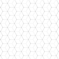
img/hexagonal-pattern.jpg (Source):
h1 {
  background-image: url(img/hexagonal-pattern.jpg);
  padding: 20px;
}
Output:
Lorem ipsum dolor
References
Background Image (Gradient)
Linear Gradient
.bwbg {
  background-image: linear-gradient(#000, #fff);
}

.bwsidebg {
  background-image: linear-gradient(to right top, #000, #fff);
}

.greytranspbg {
  background-image: linear-gradient(45deg, rgba(0, 0, 0, .70), transparent);
}

.bluegreenbg {
  background-image: linear-gradient(45deg, rgba(0, 145, 200, .6), rgba(1, 193, 120, .6));
}
Output:
Radial Gradient
.bwbg {
  background-image: radial-gradient(#000, #fff);
}

.bwsidebg {
  background-image: radial-gradient(circle at center, #000, #fff);
}

.greytranspbg {
  background-image: radial-gradient(circle at 10px 10px, rgba(0, 0, 0, .70), transparent);
}

.bluegreenbg {
  background-image: radial-gradient(farthest-corner at 40px 40px, rgba(0, 145, 200, .6), rgba(1, 193, 120, .6));
}
Output:
References
- linear-gradient()
- repeating-linear-gradient()
- radial-gradient()
- repeating-radial-gradient()
- Radial Gradient Recipes
Background Image (Multiple backgrounds)
.multiple {
  background-image: linear-gradient(45deg, rgba(0, 0, 0, .70) 10%, transparent), url(img/image.jpg);
}

.trendbg {
  background-image: linear-gradient(45deg, rgba(0, 145, 200, .6), rgba(1, 193, 120, .6)), url(img/image.jpg);
}
Output:
Background Repeat
Value:
<repeat-style>
<repeat-style>: repeat | repeat-x | repeat-y | no-repeat
Syntax
/* Keyword values */
background-repeat: repeat-x;
background-repeat: repeat-y;
background-repeat: repeat;
background-repeat: no-repeat;
Example

body {
  background-image: url(img/pattern.png);
  background-color: #fff;
  background-repeat: repeat;
}
Output:
body {
  background-image: url(img/pattern.png);
  background-color: #fff;
  background-repeat: no-repeat;
}
Output:
Reference
- Continuous Background Graphics
- Continuos Background
- Seamless Pattern Graphics
- Strip Generator
- Gradient
Background Position
Value:
<bg-position>
Syntax
/* Keyword values */
background-position: top;
background-position: bottom;
background-position: left;
background-position: right;
background-position: center;
background-position: center right;

/* <percentage> values */
background-position: 25% 75%;

/* <length> values */
background-position: 0 0;
background-position: 1cm 2cm;
background-position: 10ch 8em;

/* Edge offsets values */
background-position: bottom 10px right 20px;
background-position: right 3em bottom 10px;
Example
a[href*="http"] {
  background-image: url('img/external-link-16.png');
  background-repeat: no-repeat;
  background-position: 100% 5px;
  padding-right: 19px;
}
Output:
Reference
Background Size
Value: contain | cover | auto |
<length>|<percentage>
Syntax
/* Keyword values */
background-size: cover;
background-size: contain;

/* One-value syntax */
/* the width of the image (height becomes 'auto') */
background-size: 50%;
background-size: 3.2em;
background-size: 12px;
background-size: auto;

/* Two-value syntax */
/* first value: width of the image, second value: height */
background-size: 50% auto;
background-size: 3em 25%;
background-size: auto 6px;
background-size: auto auto;

/* Multiple backgrounds */
background-size: auto, auto; /* Not to be confused with `auto auto` */
background-size: 50%, 25%, 25%;
background-size: 6px, auto, contain;
Example
.auto {
  background-size: auto;
}

.size100 {
  background-size: 100px;
}

.cover {
  background-size: cover;
}

.contain {
  background-size: contain;
}
Output:
Background Attachment
Value: fixed | scrool | local
Syntax
/* Keyword values */
background-attachment: scroll;
background-attachment: fixed;
background-attachment: local;
Example
header {
  background-color: tomato;
  background-image: url(img/clock.jpg);
  background-position: 0 -100px;
  background-size: cover;
  background-repeat: no-repeat;
  background-attachment: fixed;
  background-blend-mode: multiply;
}
Output:
Background Blend Mode
Value:
<blend-mode>
<blend-mode>= normal | multiply | screen | overlay | darken | lighten | color-dodge | color-burn | hard-light | soft-light | difference | exclusion | hue | saturation | color | luminosity
Syntax
/* One value */
background-blend-mode: normal;

/* Two values, one per background */
background-blend-mode: darken, luminosity;
Example
.bg {
  background-image: url(img/computer.jpg);
  background-size: cover;
  background-color: rgba(1, 193, 120, .9);
}

.normal {
  background-blend-mode: normal;
}

.multiply {
  background-blend-mode: multiply;
}

.screen {
  background-blend-mode: screen;
}

.overlay {
  background-blend-mode: overlay;
}

.darken {
  background-blend-mode: darken;
}

.lighten {
  background-blend-mode: lighten;
}
Output:
References
Background Shorthand
Value: [
<bg-layer>, ]*<final-bg-layer>
<bg-layer>=<bg-image>||<bg-position>[ /<bg-size>]? ||<repeat-style>||<attachment>||<box>||<box>
<final-bg-layer>=<background-color>||<bg-image>||<bg-position>[ /<bg-size>]? ||<repeat-style>||<attachment>||<box>||<box>
Syntax
/* Using a <background-color> */
background: green;

/* Using a <bg-image> and <repeat-style> */
background: url("test.jpg") repeat-y;

/* Using a <box> and <background-color> */
background: border-box red;

/* A single image, centered and scaled */
background: no-repeat center/80% url("../img/image.png");
Example Shorthand
header {
  background-color: tomato;
  background-image: url(img/clock.jpg);
  background-position: 0 -100px;
  background-size: cover;
  background-repeat: no-repeat;
  background-attachment: fixed;
  background-blend-mode: multiply;
}
header {
  background: tomato url(../img/clock.jpg) 0 -100px/cover no-repeat fixed;
  background-blend-mode: multiply;
}
Example Sprite
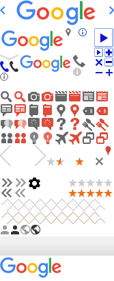
.google {
  background: url(../img/google.png) no-repeat -24px 0;
  width: 116px;
  height: 37px;
}
References:
Filter
Value: none | [
<filter-function>|<url>]+
<filter-function>=<blur()> |<brightness()> |<contrast()> |<drop-shadow()> |<grayscale()> |<hue-rotate()> |<invert()> |<opacity()> |<saturate()> |<sepia()>
Syntax
/* URL to SVG filter */
filter: url("filters.svg#filter-id");

/* <filter-function> values */
filter: blur(5px);
filter: brightness(0.4);
filter: contrast(200%);
filter: drop-shadow(16px 16px 20px blue);
filter: grayscale(50%);
filter: hue-rotate(90deg);
filter: invert(75%);
filter: opacity(25%);
filter: saturate(30%);
filter: sepia(60%);

/* Multiple filters */
filter: contrast(175%) brightness(3%);
Example
.bg {
  background-image: url(img/computer.jpg);
  background-size: cover;
  background-color: rgba(1, 193, 120, .9);
}

.blur {
  filter: blur(5px);
}

.brightness {
  filter: brightness(0.4);
}

.contrast {
  filter: contrast(200%);
}

.grayscale {
  filter: grayscale(50%);
}

.sepia {
  filter: sepia(60%);
}
Output:
Opacity
Value:
<number>
<number>(0..1)
Syntax
opacity: 0;
opacity: 0.33;
opacity: 1;
Example
img {
  opacity: .5;
}

img:hover {
  opacity: 1;
}
Output: